您现在的位置是:网站首页> 编程资料编程资料
详解CSS3实现响应式手风琴效果CSS3防疫知识图文响应式布局代码CSS3响应式个人名片图文布局代码css3 响应式媒体查询的示例代码HTML5 图片悬停放大的实现代码示例html用title属性实现鼠标悬停显示文字 html+css实现响应式卡片悬停效果
 2021-09-03
947人已围观
2021-09-03
947人已围观
简介 这篇文章主要介绍了详解CSS3实现响应式手风琴效果,文中通过示例代码介绍的非常详细,对大家的学习或者工作具有一定的参考学习价值,需要的朋友们下面随着小编来一起学习学习吧
最近看了国外大佬用CSS3实现手风琴效果的视频,所以自己学习后写了一下,以博客的形式记录下来,方便自己日后复习,代码结构如下(字体用的是Genericons ):
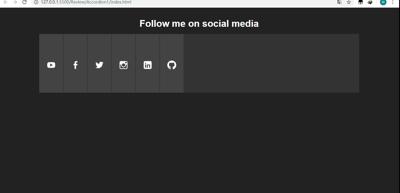
最终效果如下:
全屏时:
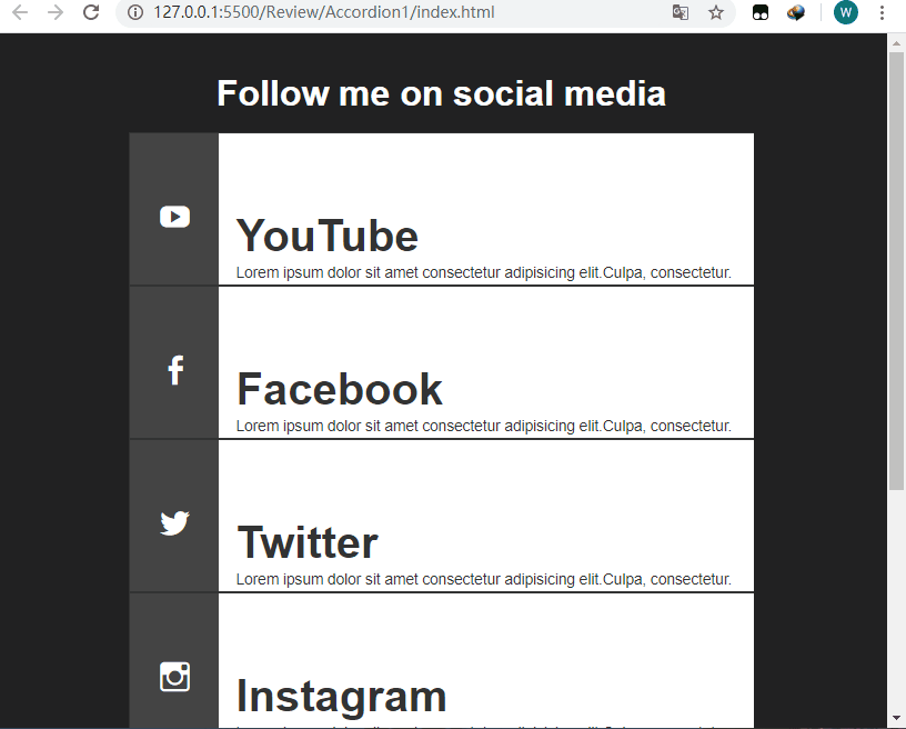
屏幕宽度小于960px时:
下面来看一下页面的基本结构(index.html):
Document Follow me on social media
YouTube
Lorem ipsum dolor sit amet consectetur adipisicing elit.Culpa, consectetur.
Lorem ipsum dolor sit amet consectetur adipisicing elit.Culpa, consectetur.
Lorem ipsum dolor sit amet consectetur adipisicing elit.Culpa, consectetur.
Lorem ipsum dolor sit amet consectetur adipisicing elit.Culpa, consectetur.
Lorem ipsum dolor sit amet consectetur adipisicing elit.Culpa, consectetur.
Github
Lorem ipsum dolor sit amet consectetur adipisicing elit.Culpa, consectetur.
样式(style.css):
*{ margin: 0; padding: 0; border: none; } body{ font-family: Arial, Helvetica, sans-serif; background-color: #222; color: #fff; } /*设置字体,因为后面的图标需要用到*/ @font-face { font-family: 'Genericons'; src: url('font/genericons-regular-webfont.woff') format('woff'), url('font/genericons-regular-webfont.eot') format('truetype'); } /*设置外面容器的宽度*/ .container{ width: 80%; margin: 20px auto; } header h1{ font-size: 2rem; padding: 1rem; text-align: center; } /*注意这里font-size设置为0,不然会出现非常糟糕的画面,我们后面再去单独对需要现实的文本设置字体大小 ,因为a链接不想让它显示内容*/ .accordion{ width: 100%; min-width: 800px; height: 200px; background-color: #333; list-style: none; display: block; overflow: hidden; font-size: 0; } /*对每一个li设置为inline-block,让其排列在一行,溢出隐藏,因为.tab下面的.content宽度为360,而且.tab只有在hover的时候宽度才会变成450px,那时候.content刚好显示.另外设置过渡,使其宽度增长的过程平缓*/ .tab{ width: 80px; height: 100%; display: inline-block; position: relative; margin: 0; background-color: #444; border: 1px solid #333; overflow: hidden; transition: all .5s ease .1s; } .tab:hover{ width: 450px; } .tab:hover .social a:after{ transform: translateX(-80px); } .tab:hover .social a:before{ transform: translateX(-100px); } /*设置定位为相对定位,不然.content会有部分内容被遮住*/ .tab .content{ position: relative; width: 360px; height: 100%; background-color: #fff; color: #333; margin-left: 80px; padding: 50px 0 0 15px; } .tab .content h1{ font-size: 2.5rem; margin-top: 20px; } .tab .content p{ font-size: .85rem; line-height: 1.6; } /设置为元素的宽高及字体为Genericons,不然图标无法显现,只会显示白色的空框框/ .social a:before, .social a:after{ position: absolute; width: 80px; height: 200px; display: block; text-indent: 0; padding-top: 90px; padding-left: 25px; font:normal 30px Genericons; color: #fff; transition: all .5s ease; } /*因为当我们hover上去的时候图标会更大,所以after伪类的字体及padding要重新设置,同时 要将margin-left设置为80px,这要默认情况下显示的就是before伪类的小图标*/ .social a:after{ font-size: 48px; padding-top: 80px; padding-left: 20px; margin-left: 80px; } /*Add icons*/ .youtube a:before, .youtube a:after{ content: '\f213'; } .youtube a:after{ background-color: #fc0000; } .twitter a:before, .twitter a:after{ content: '\f202'; } .twitter a:after{ background-color: #6dc5dd; } .facebook a:before, .facebook a:after{ content: '\f204'; } .facebook a:after{ background-color: #3b5998; } .linkedin a:before, .linkedin a:after{ content: '\f208'; } .linkedin a:after{ background-color: #00a9cd; } .instagram a:before, .instagram a:after{ content: '\f215'; } .instagram a:after{ background-color: #6dc993; } .github a:before, .github a:after{ content: '\f200'; } .github a:after{ background-color: #6e5494; } /*当屏幕最大宽度为960px时*/ @media(max-width:960px){ .container{ width: 70%; } /*让高度为auto*/ .accordion{ min-width: 450px; height: auto; } /*让li显示为block,这样就会依次往下排*/ .tab{ width: 100%; display: block; border-bottom: 1px solid #333; } /*这个一定要设置,因为原本的.tab:hover时宽度为450px,假如.tab的宽度有600px,在hover时就回剩余150px的空白,不是我们想要的效果*/ .tab:hover{ width: 100%; } .tab .content{ width: 85%; } /*设置对应伪类的padding值,使其大概显示在中间*/ .social a:before{ padding-top: 60px; padding-left: 25px; } .social a:after{ padding-top: 50px; padding-left: 20px; } }到此这篇关于详解CSS3实现响应式手风琴效果的文章就介绍到这了,更多相关CSS3响应式手风琴内容请搜索以前的文章或继续浏览下面的相关文章,希望大家以后多多支持!
相关内容
- css实现朋友圈照片排列布局的代码CSS实现动态图片的九宫格布局的实例代码css3 图片圆形显示 如何CSS将正方形图片显示为圆形图片布局DIV+CSS中让布局、背景图片、文字内容居中的方法css中文字加图片的布局实现input输入框中有图片怎么使用css布局实现用CSS布局复杂的图片边框实例
- CSS通过letter-spacing属性 控制字与字间隔 IE7与FF下的letter-spacing属性兼容性写法inline-block空隙之css letter-spacing与字体大小/字体关系数据表CSS文字控制之letter-spacing和word-spacing
- css 布局 之 两端布局的实例代码 (利用父级负的margin)css如何利用负margin技术实现平均布局css布局之负margin妙用及其他实现CSS中使用负margin值来调整居中位置css利用负margin实现平均布局的示例
- CSS3实现淘宝留白的方法css3中transform属性实现的4种功能详解CSS3.0(Cascading Style Sheet) 层叠级联样式表纯CSS3实现div按照顺序出入效果CSS3实现列表无限滚动/轮播效果css3 利用transform-origin 实现圆点分布在大圆上布局及旋转特效CSS3实现的侧滑菜单CSS3实现的3D隧道效果用CSS3画一个爱心css3 实现文字闪烁效果的三种方式示例代码六种css3实现的边框过渡效果
- css实现背景虚化效果的示例代码CSS Transition通过改变Height实现展开收起元素从QQtabBar看css命名规范BEM的详细介绍css实现两栏布局,左侧固定宽,右侧自适应的多种方法CSS 实现Chrome标签栏的技巧CSS实现两列布局的N种方法CSS实现隐藏搜索框功能(动画正反向序列)CSS3中Animation实现简单的手指点击动画的示例详解CSS中的特指度和层叠问题详解overflow:hidden的作用(溢出隐藏、清除浮动、解决外边距塌陷)关于CSS浮动与取消浮动的问题
- 浅谈Flex布局与缩放比例计算Flex布局做出自适应页面(语法和案例)详解flex布局中保持内容不超出容器的解决办法flex弹性盒布局最后一行左对齐的实现思路深入浅析CSS3中的Flex布局整理详解CSS中的flex布局css用Flex布局制作简易柱状图的实现flex布局兼容性问题小结详解flex布局的元素如何分配容器的剩余空间flex布局被子元素撑开如何保持内容不超出容器的方法flex布局实现左侧文字溢出省略右侧文字自适应
- CSS样式书写顺序和命名规范及注意事项CSS使用BEM命名规范实践值得收藏的CSS命名规范(规则)常用的CSS命名规则 好的 CSS 命名规范可以节约 Debug 时间css 命名:BEM, scoped css, css modules 与 css-in-js详解CSS规范BEM CSS和OOCSS的示例代码详解详解css BEM书写规范 从QQtabBar看css命名规范BEM的详细介绍
- css实现缕空遮罩层的示例代码使用CSS content的attr实现鼠标悬浮提示(tooltip)效果CSS实现鼠标悬浮无限向下级展示的实例代码CSS鼠标悬浮DIV后显示DIV外的按钮解决方法CSS3制作了一个动画导航效果(鼠标悬浮会放大)css3遮罩层镂空效果的多种实现方法CSS实现带遮罩层可关闭的弹窗效果CSS实现鼠标移至图片上显示遮罩层效果CSS 鼠标悬浮在图片上添加遮罩层效果的实现
- 使用CSS实现三栏自适应布局(两边宽度固定,中间自适应)CSS实现三栏布局中间一栏自适应且随文字大小变化宽度的示例代码CSS columns实现两端对齐布局的示例代码用CSS Grid布局制作一个响应式柱状图的实现解决CCS中的margin:top塌陷问题css如何利用负margin技术实现平均布局CSS 外边距(margin)重叠及防止方法解决margin 外边距合并问题 css 布局 之 两端布局的实例代码 (利用父级负的margin)
- CSS实现三栏布局中间一栏自适应且随文字大小变化宽度的示例代码使用CSS实现三栏自适应布局(两边宽度固定,中间自适应)CSS columns实现两端对齐布局的示例代码用CSS Grid布局制作一个响应式柱状图的实现解决CCS中的margin:top塌陷问题css如何利用负margin技术实现平均布局CSS 外边距(margin)重叠及防止方法解决margin 外边距合并问题 css 布局 之 两端布局的实例代码 (利用父级负的margin)